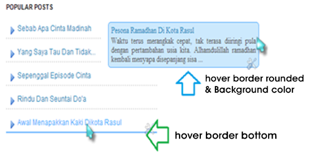
Go Widget - Previously I
never explores how to add a widget popular posts on the blog, blogger default
widget is a widget popular posts based on page views that zoom standard, on
this occasion God willing I would like to share how to modify the widget
popular posts by adding a hover effect border and background color.
Interested to try? Please
follow the steps below:
1. Once logged into your
account on the layout >> Add
>> Add gadgets popular blogger posts innate and configure the widget
with thumbnail mencenteng small box and snippets. Then save. If you do not
already know how to add widgets congenital popular blogger posts, please see
the tutorial here
2. Then go to the section
edit HTML templates >> Find
the code ]]>
</ b: skin>
3. Copy and paste the
following CSS code above the code ]]> </ b: skin>
Code
for the hover effect border bottom color:
CSS - Go Widget
.popular-posts ul{padding-left:0px;}
.popular-posts ul li {background: #fff url(https://blogger.googleusercontent.com/img/b/R29vZ2xl/AVvXsEhi3N2_Su3CglBT-udSIVuPYBBLUKhwoRZCc18NcBxK0UigeSvvYpZxXDl21s-u3iuIlh2-v6Axymdj7VF8C5_LhfS5MdW4DZjA3QmDpjPcm_Fx55gr4E4xtposSd9iKVhEMzFV5rVdrow/s1600/helperblogger-list-style-icon.png)
no-repeat scroll 5px 10px;
list-style-type: none;
margin:0 0 5px 0px;
padding:8px 5px 7px 22px !important;
border-bottom: 2px dotted #dddddd;
}
.popular-posts ul li:hover {
border-bottom: 2px solid #6BB5FF;
}
.popular-posts ul li a:hover {
text-decoration:none;
}
Code
for the hover effect color rounded border
CSS - Go Widget
.popular-posts
ul{padding-left:0px;}
.popular-posts ul li
{background: #FFF url(http://1.bp.blogspot.com/_7wsQzULWIwo/
SmodosCuJCI/AAAAAAAABh4/ZSXbVW9Qpa8/s400/261.gif) no-repeat scroll
5px 10px;
list-style-type: none;
margin:0 0 5px 0px;
padding:5px 5px 5px 20px
!important;
border: 1px solid #dddddd;
border-radius:10px;
-moz-border-radius:10px;
-webkit-border-radius:10px;
}
.popular-posts ul li:hover {
border:1px solid #6BB5FF;
}
.popular-posts ul li a:hover
{
text-decoration:none;
}
Code
for the hover effect rounded border and background color
As with the above code, you
simply just add the following code background color code as follows:
CSS - Go Widget
Note the above code blue is the color code used to hover border and background, you can change the color according to your wishes.
If you liked the article on
this blog, Please feel free to subscribe via email, so you will get an article
submission every article published in Go Widget

